 百木园
百木园前言
嗨喽~大家好呀,这里是魔王呐
在前一章:让我们用python来采集数据看看找工作都要会什么吧~
我们讲了如何采集zhaopin网站数据,现在~
我们来把数据可视化,更好的查看在自己领域最需的技术是什么~
下面,我们直接上代码~
代码提供者:青灯教育-自游老师
代码
import pandas as pd
from pyecharts.charts import *
from pyecharts import options as opts
import re
from pyecharts.globals import ThemeType
from pyecharts.commons.utils import JsCode
# 读取数据
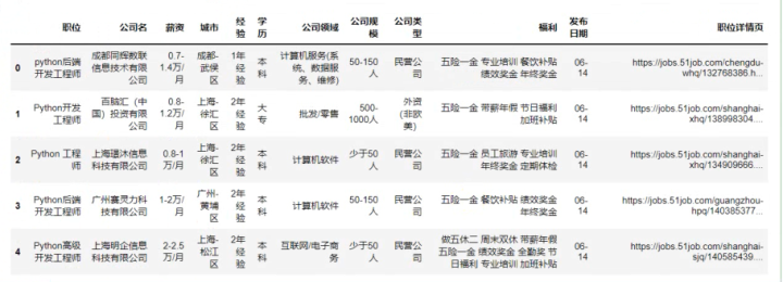
df = pd.read_csv(\"招聘数据.csv\")
df.head()
df.info()
df[\'薪资\'].unique()
df[\'bottom\']=df[\'薪资\'].str.extract(\'^(\\d+).*\')
df[\'top\']=df[\'薪资\'].str.extract(\'^.*?-(\\d+).*\')
df[\'top\'].fillna(df[\'bottom\'],inplace=True)
df[\'commision_pct\']=df[\'薪资\'].str.extract(\'^.*?·(\\d{2})薪\')
df[\'commision_pct\'].fillna(12,inplace=True)
df[\'commision_pct\']=df[\'commision_pct\'].astype(\'float64\')
df[\'commision_pct\']=df[\'commision_pct\']/12
df.dropna(inplace=True)
df[\'bottom\'] = df[\'bottom\'].astype(\'int64\')
df[\'top\'] = df[\'top\'].astype(\'int64\')
df[\'平均薪资\'] = (df[\'bottom\']+df[\'top\'])/2*df[\'commision_pct\']
df[\'平均薪资\'] = df[\'平均薪资\'].astype(\'int64\')
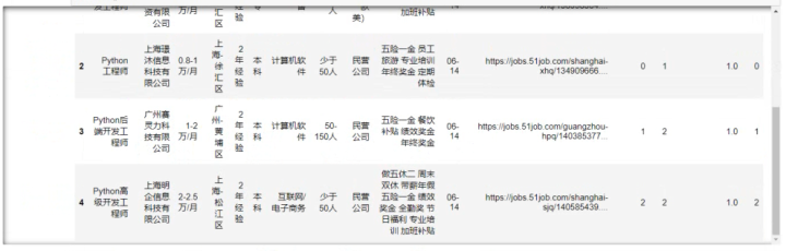
df.head()
df[\'薪资\'] = df[\'薪资\'].apply(lambda x:re.sub(\'.*千/月\', \'0.3-0.7万/月\', x))
df[\"薪资\"].unique()
df[\'bottom\'] = df[\'薪资\'].str.extract(\'^(.*?)-.*?\')
df[\'top\'] = df[\'薪资\'].str.extract(\'^.*?-(\\d\\.\\d|\\d)\')
df.dropna(inplace=True)
df[\'bottom\'] = df[\'bottom\'].astype(\'float64\')
df[\'top\'] = df[\'top\'].astype(\'float64\')
df[\'平均薪资\'] = (df[\'bottom\']+df[\'top\'])/2 * 10
df.head()
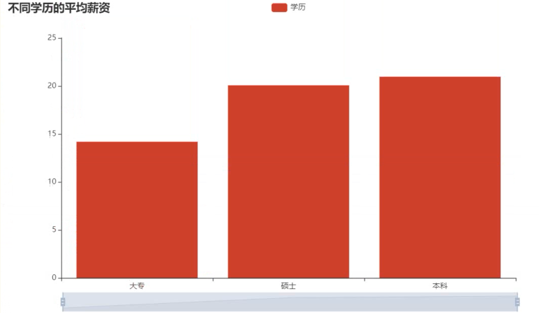
mean = df.groupby(\'学历\')[\'平均薪资\'].mean().sort_values()
x = mean.index.tolist()
y = mean.values.tolist()
c = (
    Bar()
    .add_xaxis(x)
    .add_yaxis(
        \"学历\",
        y
    )
    .set_global_opts(title_opts=opts.TitleOpts(title=\"不同学历的平均薪资\"),datazoom_opts=opts.DataZoomOpts())
    .set_series_opts(label_opts=opts.LabelOpts(is_show=False))
)
c.render_notebook()
color_js = \"\"\"new echarts.graphic.LinearGradient(0, 1, 0, 0,
[{offset: 0, color: \'#63e6be\'}, {offset: 1, color: \'#0b7285\'}], false)\"\"\"
color_js1 = \"\"\"new echarts.graphic.LinearGradient(0, 0, 0, 1, [{
offset: 0,
color: \'#ed1941\'
}, {
offset: 1,
color: \'#009ad6\'
}], false)\"\"\"
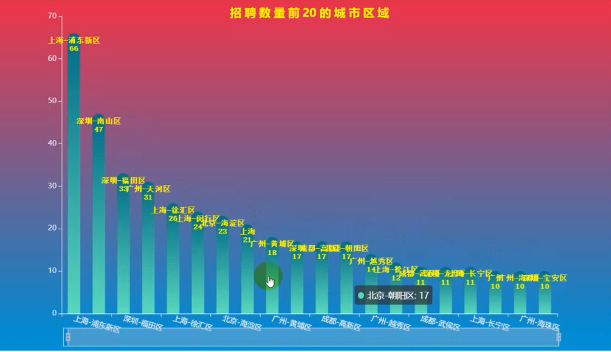
dq = df.groupby(\'城市\')[\'职位\'].count().to_frame(\'数量\').sort_values(by=\'数量\',ascending=False).reset_index()
x_data = dq[\'城市\'].values.tolist()[:20]
y_data = dq[\'数量\'].values.tolist()[:20]
b1 = (
Bar(init_opts=opts.InitOpts(theme=ThemeType.DARK,bg_color=JsCode(color_js1),width=\'1000px\',height=\'600px\'))
.add_xaxis(x_data)
.add_yaxis(\'\',
y_data ,
category_gap=\"50%\",
label_opts=opts.LabelOpts(
font_size=12,
color=\'yellow\',
font_weight=\'bold\',
font_family=\'monospace\',
position=\'insideTop\',
formatter = \'{b}\\n{c}\'
),
)
.set_series_opts(
itemstyle_opts={
\"normal\": {
\"color\": JsCode(color_js),
\"barBorderRadius\": [15, 15, 0, 0],
\"shadowColor\": \"rgb(0, 160, 221)\",
}
}
)
.set_global_opts(
title_opts=opts.TitleOpts(title=\'招 聘 数 量 前 20 的 城 市 区 域\',
title_textstyle_opts=opts.TextStyleOpts(color=\"yellow\"),
pos_top=\'7%\',pos_left = \'center\'
),
legend_opts=opts.LegendOpts(is_show=False),
xaxis_opts=opts.AxisOpts(axislabel_opts=opts.LabelOpts(rotate=-15)),
yaxis_opts=opts.AxisOpts(name=\"\",
name_location=\'middle\',
name_gap=40,
name_textstyle_opts=opts.TextStyleOpts(font_size=16)),
datazoom_opts=[opts.DataZoomOpts(range_start=1,range_end=50)]
)
)
b1.render_notebook()
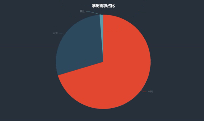
boss = df[\'学历\'].value_counts()
x = boss.index.tolist()
y = boss.values.tolist()
data_pair = [list(z) for z in zip(x, y)]
c = (
    Pie(init_opts=opts.InitOpts(width=\"1000px\", height=\"600px\", bg_color=\"#2c343c\"))
    .add(
        series_name=\"学历需求占比\",
        data_pair=data_pair,
        label_opts=opts.LabelOpts(is_show=False, position=\"center\", color=\"rgba(255, 255, 255, 0.3)\"),
    )
    .set_series_opts(
        tooltip_opts=opts.TooltipOpts(
            trigger=\"item\", formatter=\"{a} <br/>{b}: {c} ({d}%)\"
        ),
        label_opts=opts.LabelOpts(color=\"rgba(255, 255, 255, 0.3)\"),
    )
    .set_global_opts(
        title_opts=opts.TitleOpts(
            title=\"学历需求占比\",
            pos_left=\"center\",
            pos_top=\"20\",
            title_textstyle_opts=opts.TextStyleOpts(color=\"#fff\"),
        ),
        legend_opts=opts.LegendOpts(is_show=False),
    )
    .set_colors([\"#D53A35\", \"#334B5C\", \"#61A0A8\", \"#D48265\", \"#749F83\"])
)
c.render_notebook()
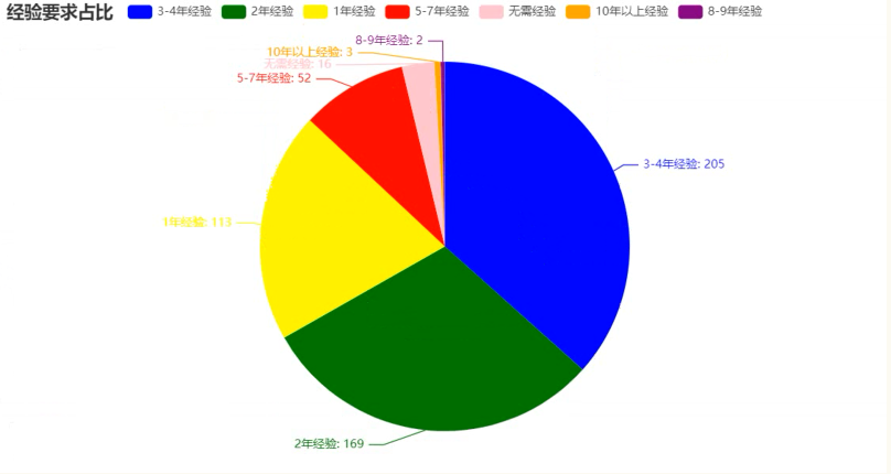
boss = df[\'经验\'].value_counts()
x = boss.index.tolist()
y = boss.values.tolist()
data_pair = [list(z) for z in zip(x, y)]
c = (
    Pie(init_opts=opts.InitOpts(width=\"1000px\", height=\"600px\", bg_color=\"#2c343c\"))
    .add(
        series_name=\"经验需求占比\",
        data_pair=data_pair,
        label_opts=opts.LabelOpts(is_show=False, position=\"center\", color=\"rgba(255, 255, 255, 0.3)\"),
    )
    .set_series_opts(
        tooltip_opts=opts.TooltipOpts(
            trigger=\"item\", formatter=\"{a} <br/>{b}: {c} ({d}%)\"
        ),
        label_opts=opts.LabelOpts(color=\"rgba(255, 255, 255, 0.3)\"),
    )
    .set_global_opts(
        title_opts=opts.TitleOpts(
            title=\"经验需求占比\",
            pos_left=\"center\",
            pos_top=\"20\",
            title_textstyle_opts=opts.TextStyleOpts(color=\"#fff\"),
        ),
        legend_opts=opts.LegendOpts(is_show=False),
    )
    .set_colors([\"#D53A35\", \"#334B5C\", \"#61A0A8\", \"#D48265\", \"#749F83\"])
)
c.render_notebook()
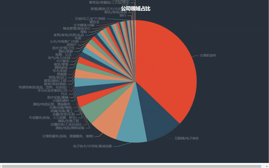
boss = df[\'公司领域\'].value_counts()
x = boss.index.tolist()
y = boss.values.tolist()
data_pair = [list(z) for z in zip(x, y)]
c = (
    Pie(init_opts=opts.InitOpts(width=\"1000px\", height=\"600px\", bg_color=\"#2c343c\"))
    .add(
        series_name=\"公司领域占比\",
        data_pair=data_pair,
        label_opts=opts.LabelOpts(is_show=False, position=\"center\", color=\"rgba(255, 255, 255, 0.3)\"),
    )
    .set_series_opts(
        tooltip_opts=opts.TooltipOpts(
            trigger=\"item\", formatter=\"{a} <br/>{b}: {c} ({d}%)\"
        ),
        label_opts=opts.LabelOpts(color=\"rgba(255, 255, 255, 0.3)\"),
    )
    .set_global_opts(
        title_opts=opts.TitleOpts(
            title=\"公司领域占比\",
            pos_left=\"center\",
            pos_top=\"20\",
            title_textstyle_opts=opts.TextStyleOpts(color=\"#fff\"),
        ),
        legend_opts=opts.LegendOpts(is_show=False),
    )
    .set_colors([\"#D53A35\", \"#334B5C\", \"#61A0A8\", \"#D48265\", \"#749F83\"])
)
c.render_notebook()
from pyecharts import options as opts
from pyecharts.charts import Pie
from pyecharts.faker import Faker
boss = df[\'经验\'].value_counts()
x = boss.index.tolist()
y = boss.values.tolist()
data_pair = [list(z) for z in zip(x, y)]

c = (
    Pie()
    .add(\"\", data_pair)
    .set_colors([\"blue\", \"green\", \"yellow\", \"red\", \"pink\", \"orange\", \"purple\"])
    .set_global_opts(title_opts=opts.TitleOpts(title=\"经验要求占比\"))
    .set_series_opts(label_opts=opts.LabelOpts(formatter=\"{b}: {c}\"))
)
c.render_notebook()
from pyecharts import options as opts
from pyecharts.charts import Pie
from pyecharts.faker import Faker
boss = df[\'经验\'].value_counts()
x = boss.index.tolist()
y = boss.values.tolist()
data_pair = [list(z) for z in zip(x, y)]
c = (
Pie()
.add(
\"\",
data_pair,
radius=[\"40%\", \"55%\"],
label_opts=opts.LabelOpts(
position=\"outside\",
formatter=\"{a|{a}}{abg|}\\n{hr|}\\n {b|{b}: }{c} {per|{d}%} \",
background_color=\"#eee\",
border_color=\"#aaa\",
border_width=1,
border_radius=4,
rich={
\"a\": {\"color\": \"#999\", \"lineHeight\": 22, \"align\": \"center\"},
\"abg\": {
\"backgroundColor\": \"#e3e3e3\",
\"width\": \"100%\",
\"align\": \"right\",
\"height\": 22,
\"borderRadius\": [4, 4, 0, 0],
},
\"hr\": {
\"borderColor\": \"#aaa\",
\"width\": \"100%\",
\"borderWidth\": 0.5,
\"height\": 0,
},
\"b\": {\"fontSize\": 16, \"lineHeight\": 33},
\"per\": {
\"color\": \"#eee\",
\"backgroundColor\": \"#334455\",
\"padding\": [2, 4],
\"borderRadius\": 2,
},
},
),
)
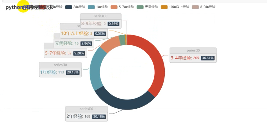
.set_global_opts(title_opts=opts.TitleOpts(title=\"python招聘经验要求\"))
)
c.render_notebook()
gsly = df[\'公司领域\'].value_counts()[:10]
x1 = gsly.index.tolist()
y1 = gsly.values.tolist()
c = (
    Bar()
    .add_xaxis(x1)
    .add_yaxis(
        \"公司领域\",
        y1
    )
    .set_global_opts(title_opts=opts.TitleOpts(title=\"公司领域\"),datazoom_opts=opts.DataZoomOpts())
    .set_series_opts(label_opts=opts.LabelOpts(is_show=False))
)
c.render_notebook()
gsgm = df[\'公司规模\'].value_counts()[1:10]
x2 = gsgm.index.tolist()
y2 = gsgm.values.tolist()
c = (
    Bar()
    .add_xaxis(x2)
    .add_yaxis(
        \"公司规模\",
        y2
    )
    .set_global_opts(title_opts=opts.TitleOpts(title=\"公司规模\"),datazoom_opts=opts.DataZoomOpts())
    .set_series_opts(label_opts=opts.LabelOpts(is_show=False))
)
c.render_notebook()
import stylecloud
from PIL import Image
welfares = df[\'福利\'].dropna(how=\'all\').values.tolist()
welfares_list = []
for welfare in welfares:
    welfares_list += welfare.split(\',\')
pic_name = \'福利词云.png\'
stylecloud.gen_stylecloud(
    text=\' \'.join(welfares_list),
    font_path=\'msyh.ttc\',
    palette=\'cartocolors.qualitative.Bold_5\',
    max_font_size=100,
    icon_name=\'fas fa-yen-sign\',
    background_color=\'#212529\',
    output_name=pic_name,
    )
Image.open(pic_name)
效果(部分)
尾语
成功没有快车道,幸福没有高速路。
幸福是可以通过学习来获得的,尽管它不是我们的母语。
——励志语录
本文章到这里就结束啦~感兴趣的小伙伴可以复制代码去试试哦
对啦!!记得三连哦~ 💕 另外,欢迎大家阅读我往期的文章呀~
来源:https://www.cnblogs.com/Qqun261823976/p/16494018.html
本站部分图文来源于网络,如有侵权请联系删除。