 百木园
百木园Axis容器:
Axis代表的是x轴或者y轴的对象。包含Tick(刻度)对象,TickLabel刻度文本对象,以及AxisLabel坐标轴文本对象。axis对象有一些方法可以操作刻度和文本等。
Python爬虫、数据分析、网站开发等案例教程视频免费在线观看
https://space.bilibili.com/523606542
Python学习交流群:1039649593
1. 设置x轴和y轴label的位置:
fig = plt.figure()
axes = fig.add_subplot(111)
axes.plot(np.random.randn(10))
axes.set_xlabel(\"x coordate\")
# 设置x轴label的位置为(0.-0.1)
axes.xaxis.set_label_coords(0,-0.1)
2. 设置刻度上的刻度格式:
import matplotlib.ticker as ticker
fig = plt.figure()
axes = fig.add_subplot(111)
axes.plot(np.random.randn(10))
axes.set_xlabel(\"x coordate\")
# 创建格式化对象
formatter = ticker.FormatStrFormatter(\'%.2f\')
# 设置格式化对象
axes.yaxis.set_major_formatter(formatter)
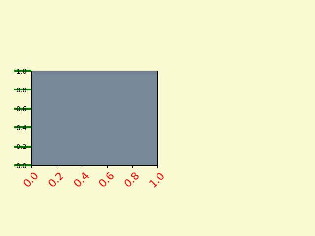
3. 设置轴的属性:
fig = plt.figure()
ax1 = fig.add_axes([0.1, 0.3, 0.4, 0.4])
ax1.set_facecolor(\'lightslategray\')
# 设置刻度上文本的属性
for label in ax1.xaxis.get_ticklabels():
# label是一个Label对象
label.set_color(\'red\')
label.set_rotation(45)
label.set_fontsize(16)
# 设置刻度上线条的属性
for line in ax1.yaxis.get_ticklines():
# line是一个Line2D对象
line.set_color(\'green\')
line.set_markersize(25)
line.set_markeredgewidth(3)
plt.show()
来源:https://www.cnblogs.com/qshhl/p/14693881.html
图文来源于网络,如有侵权请联系删除。